The notion of colour is something that only human beings experience in terms of ‘this is blue’ or ‘that is green’. We can interpret a certain frequency within the world as colour by using 3 cones in the back of our eyes. We then, as humans do, name them and have a base foundation for what those colours are. Colour theory then uses the same colours as those cones, red, blue and yellow, to mix and compliment or contrast every other known colour. But not everyone can see this way. Colour vision deficiencies can affect one or more cones in the eye and change the way colour is perceived. A famous YouTube series discusses colour in depth and asks the question, ‘is your red the same as my red?’ The presenter Michael explains that there is no possible way of knowing if another human being experiences colour the exact same way that you do on a basic level, without taking colour deficiencies into account. (Vsauce, 2013) It has been a long time since I have looked critically at my own practice with colour deficiency and the opportunity to do this here allows me to call into question colour theory and whether it is still relevant to me or even to anyone else.
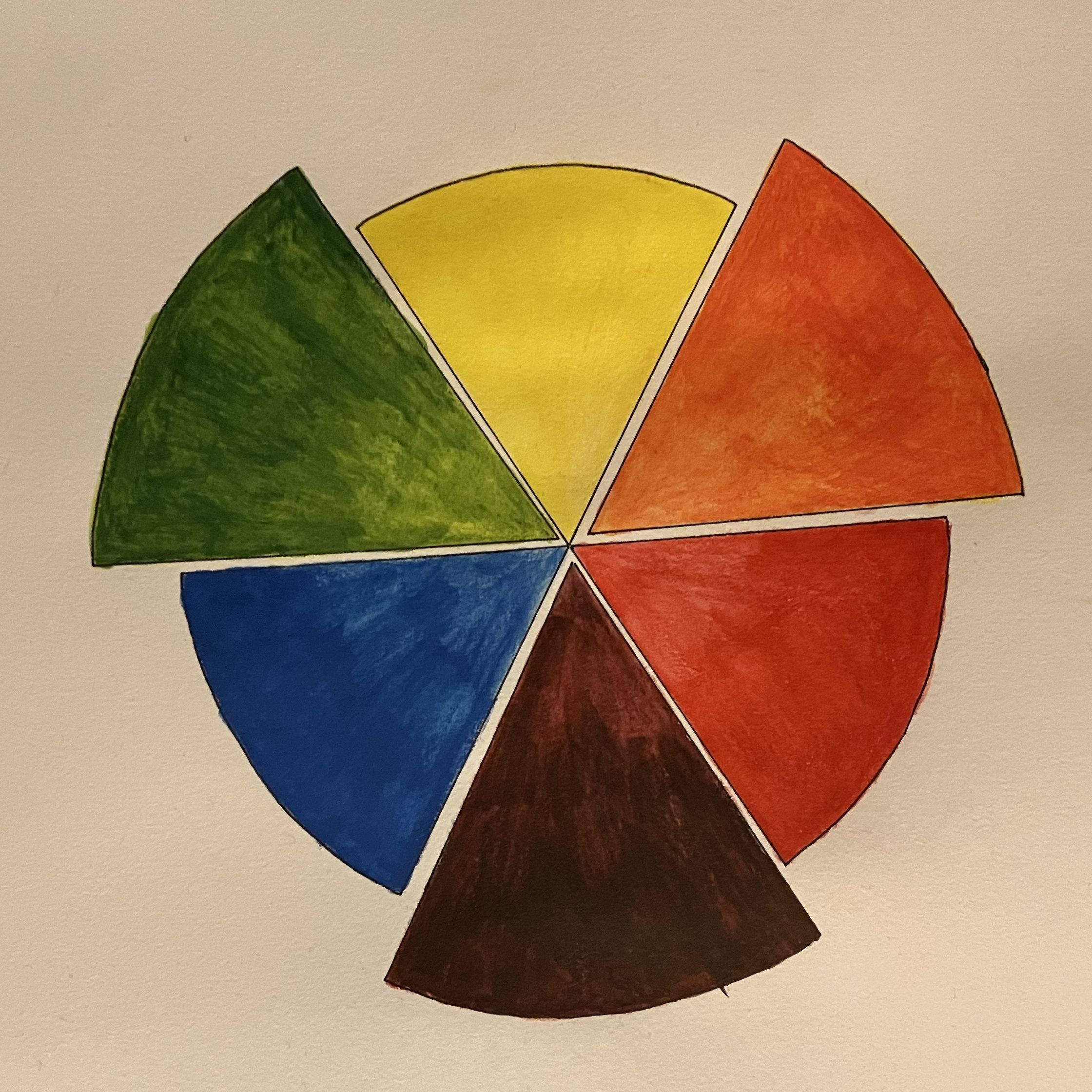
Colour theory is known as the most important thing in an artists’ toolkit. It is taught from childhood and is repeated throughout life, especially if you choose the path of an artist. YouTube is flooded with video responses for how each artist might teach colour theory as easily as possible to enhance your art. Essentially, colour theory is a guide to how things should be designed, how to make something legible, how to mix certain colours, how to elicit a feeling etc. This is all used with a basic set of 3 primary colours which can be mixed for secondary and mixed again for tertiary colours. Bleicher, in his book about contemporary colour theory, exclaims almost on the first page, “Colour is the single most important design element. No other formal design component has its unique power.” (Bleicher, 2012) He goes on to say that colour can affect feelings and even temperature within a person. It seems like a great undertaking to challenge something so grand and yet this is exactly what I need to do. Colour theory, to some people, is almost a dead language for use of root meanings, almost similar to how Latin is used today.
1 in 12 men and 1 in 200 women experience colour vision deficiency according to the NHS. Although it is rare in women the statistic for men mean that a huge amount of our population do not see colour in a ‘normal’ way. When we look around and see how much colour is used in everyday life, we can see how many people might struggle with simple things like reading warning signs correctly, being able to see the text on a webpage, play a video game or even judge traffic signals correctly. Why then are designers using the same old palettes and theories to create the world around us? Why would designers want to leave a huge portion of the population out of their designs? I personally am on the lower end of the deficiency spectrum which brings colossal amounts of extra work into my artwork to be able to design effectively. In my day-to-day life I suffer at the hands of designers who simply refuse to think about how a person perceives colour and follows colour theory blindly instead. Just this week alone I have missed out on a work training presentation because it was not legible to me but was designed to be inviting to everyone else.
Then, when we look at how multicultural modern society is in modern times, we can also see a great difference in how culture effects colour theory. I was always taught that red is warm and the colour of anger but also the colour of love. In China the colour is lucky and worn for weddings and it is also unlucky in other parts of the world. Colour theory would suggest that red be used to symbolize warmth but in countries where it is seen as unlucky, I would argue that it becomes quite cold. “A dynamic culture‐sensitive approach in colour research and its strategic use will enhance corporate image, predict purchasing behaviour and reinforce customer relationships, allowing foreign businesses to establish value‐based marketing systems and develop a competitive advantage in the emerging markets.” (Aslam, 2006) What this suggests is that colours cannot be used cross culturally to elicit the same response and an entire overhaul of the way we design must happen to be able to use design strategies effectively world-wide. Although this does not mean that colour theory is the problem it does suggest that certain parts of colour theory perhaps don’t mean the same thing cross culturally. Another paper that discusses culture and colour theory explains that colour theory has been studied throughout the ages by everyone from da Vinci to Picasso, but they have studied it as a science and something to be described and manipulated. A theory is for all intents and purposes, theoretical and not lived. The paper discusses how culture affects colour theory constantly but the ‘theoretical’ does not change with the lived culture. (Slack, 2016)
After looking at colour within cultural societies of the world we can also look at the cultural difference in generations of the world. Currently we are sitting within a digital age which promotes the use of technology and digital tools. This new generational culture begs the question of whether CMYK is the dead language. Although media is still printed, we are headed quickly into a digital reality where advertisements and other medias will be shown on screens, meaning that RGB colours will be prominent. RGB utilises a system of red, green blue with black as an absence of light, which can show highly pigmented colours on screen. CMYK uses cyan, magenta, yellow and the combination of those colours to form black and white being used as the base background colour. Printers cannot gain the same pigments used in RGB and it must be converted for printed media, something which becomes obsolete if you take away the need for printed media. A traditional artist still needs the use of CMYK but if we look at a new kind of colour theory, we can gain better colours than the original type. Sirius theory uses a 5-colour system of magenta, red, yellow, cyan, and ultramarine as its primary colours. It is possible to mix any colour and any hue from these 5 and by adding white you can achieve pastel tones. Mixing all the primaries together offers a natural black. More tones can be created because the original pallet uses a warm and cool version of both red and blue. It also enables you to mix colours without losing vibrancy or achieving ‘muddy’ colours which is the bane of a lot of people who are learning art. (Diethelm, 2021) The colours used within Sirius theory greatly resemble how CMYK printers work but, printers are dying out in favour of bolder RGB screens and Sirius theory boasts a vibrancy over original colour theory perhaps showing that traditional colouring methods are not dying out yet, but changing and in need of change.
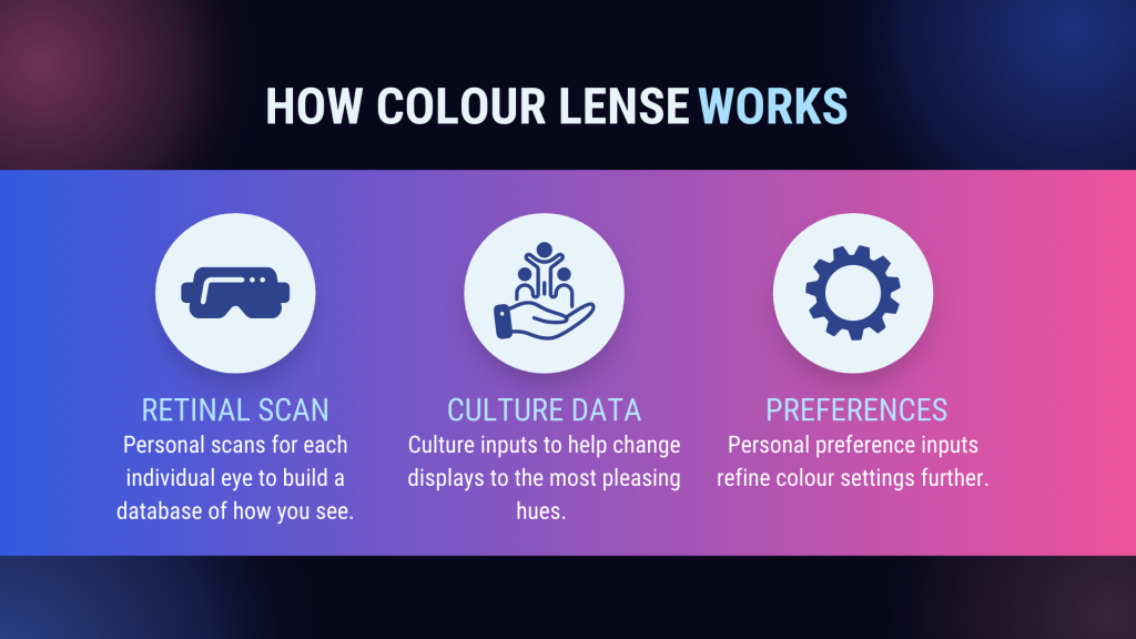
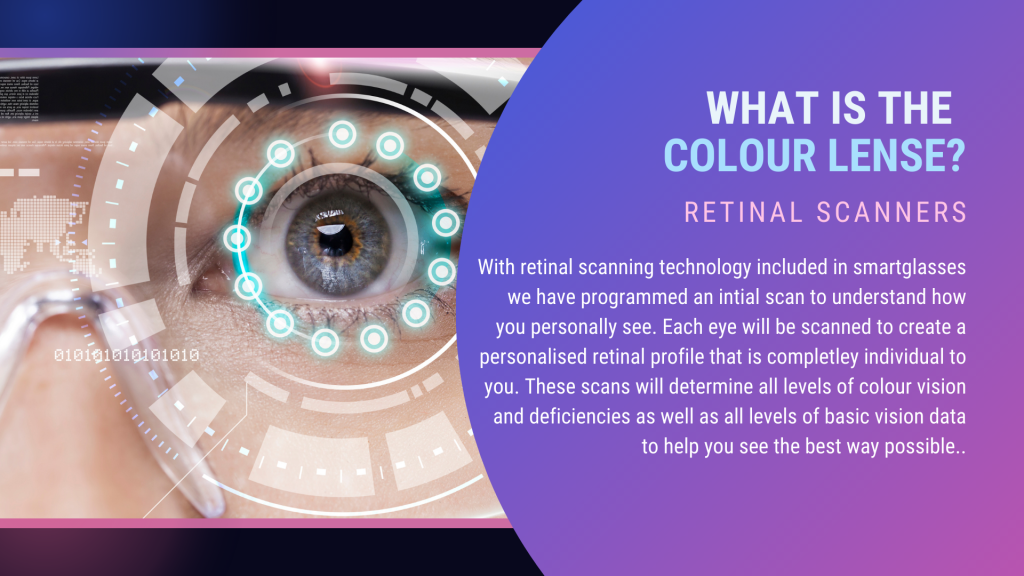
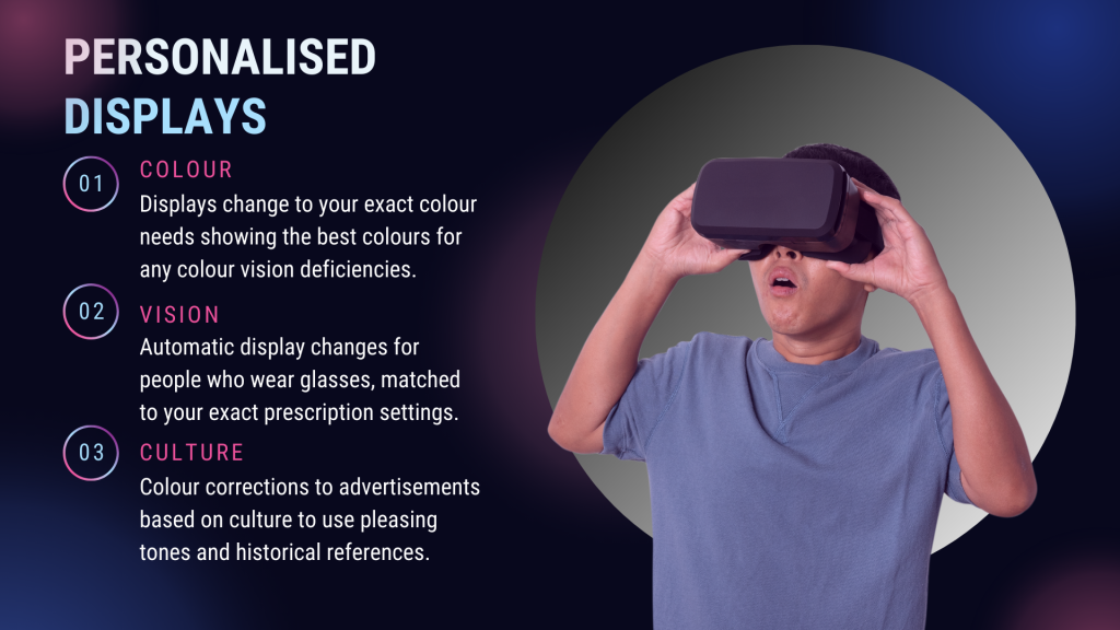
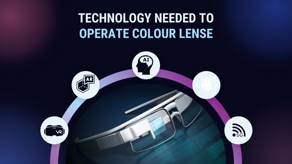
Can we look to technology then, to update colour theory for us? EnChroma glasses, released in 2012, went viral after showing colourblind people crying whilst wearing their glasses and experiencing new colours for the first time. They work by blocking parts of the light spectrum to extend colour perceived for red-green colourblind people. However, a study done with the glasses shows strong data that they either do not work or change other colours that were previously experienced normally in favour of showing new colours. This is most likely due to the range of colour vision and its deficiencies meaning that each lens would have to be customized to each eye of every individual and retested to see if this was even going to work itself. (Gomez-Robledo, 2018) With the invention of smart glasses I see a potential to fix every solution discussed here, though conceptual until the technology is ready. Apple are gearing up to release their own smart glasses and amongst the rumoured features is eye movement tracking. I propose that smart glass technology can be taken further to scan the eye of each individual to determine how they specifically see colour. Displays can then be adjusted to suit the individual user. A data input to determine cultural and generational background could also see designers work customized per person. An advert for Coca-Cola for instance could be shown with colour corrections for people with deficiencies as well as changing from red to another colour depending on what you might find more appealing based on culture.
Artist Susan Carson argues that colour is irrelevant, and value is the only important thing to use. She even teaches this instead of colour theory. On her website, Susan shows how to break a photo into values to create a portrait. This can then be coloured and textured in any way and still shows a true rendition of the face. The colours used are personal to her and her son, but the theory shows that colour is custom. The brain recognizes the values to construct the likeness and colour actually has no meaning within the image except for the personal side of colour. This shows that individuality is important here and it is individuality that elicits a response and not in fact colour theory creating the response. Susan uses Blues because it is personal to a whale campaign that she shares with her son. Colour theory suggests that this should be a cold image, but personal emotion makes it warm. (Carlson, 2015) This can be seen with artists, specifically digital artists who first paint with value and then colour correct later with the tools on a computer. They are not thinking of colour first but of value.
This subject is something that is close to my heart, and I had hoped to argue that colour theory is dead because it is not exactly relevant to me. Although I think I have greatly argued this cause I have come to the conclusion that it simply needs updating. Technology can be the way to do this for the individual. In my own practice, I have spent years devising how to understand and use colour theory through science and I believe that now, I must update my own practice. By working in value first I do not need colour theory to make a striking image and therefore, change the use of colour theory for myself and my vision deficiencies. Going forward I can use the research here to better understand colour across the world and utilize technology to customize my work for individuals rather than the masses. Sirius theory is interesting and perhaps by playing with it I can also begin to update colour theory in my practice when mixing colours with traditonal mediums. Colour theory becomes irrelevant to people who cannot experience it ‘normally’ but can still be utilized in other ways. I believe that focussing on colour theory should be put aside for an understanding of broader visions instead. As an artist and designer, it is my responsibility to take on this design challenge by challenging current colour concepts.
I have taken a basic presentation in Canva and made a concept presentation for my idea about how to personalise colour for each individual. This concept was birthed during this research and became a seed for a conceptual project. My IT and coding skills are not at a point where I am able to bring this technology into a fully realised project and invention but as a designer I can create an initial concept piece for pitching. This concept has not directly impacted my practice due to the fact that I cannot bring it into fruition, but it has helped me develope a conceptual way of thinking. I find that the most important thing as an artist is to be able to dream and use my imagination, putting my ‘far out’ ideas into an actual presentation is something that I may continue going forwards. This helps to develop an idea to find out if it is something that I can continue with or have to leave behind, essentially it serves as a mood board.
This concept has encouraged further thinking into my practice 1 module. By studying the needs of people that I may be designing for I have established a base thought whereby my clients and audience must be catered for now, not when technology catches up. I therefore will be taking this concept into my practice 1 project where I will be designing with function in mind. Further technology knowledge is needed still so that I am able to make the concept work and this is something that may not be acheieved instantly but, my development here has made colour vision, language and cultural backgrounds focal concept in practice 1 and continually thereafter.
Bibliography
Aslam, M. (2006). ‘Are you selling the right colour? A cross cultural review of colour as a marketing cue’. Journal of marketing communications. 12(1) PP15-30. [Online] Available at <https://www.tandfonline.com/doi/full/10.1080/13527260500247827?casa_token=lkt142HiWRcAAAAA%3ABgSh839uWurpoTm8_7MYVXBjjioCMVkZF-BG5JoY3RAquUS4YZiv7tOvUYU738_fUmsa8yiARby4lA > [Accessed 3/11/2022]
Bleicher, S. (2012). ‘Contemporary colour theory & use’. New York: Delmar. [Online] Available at <https://books.google.co.uk/books?hl=en&lr=&id=AUEKAAAAQBAJ&oi=fnd&pg=PR5&dq=contemporary+colour+theory+S+bleicher&ots=tNxnfbx2Xc&sig=QcMKdm6V5ToJfzDqRuPofz15mz0&redir_esc=y#v=onepage&q=contemporary%20colour%20theory%20S%20bleicher&f=false> [Accessed 3/11/2022]
Carlson, S. (2015). Susan Carlson Quilts. [Online] Available at < https://susancarlson.com/2015/12/12/why-color-is-irrelevant/ > [Accessed 3/11/2022]
Diethelm, B. (2021). ‘The five-colour theory: A new approach to colour’. Colour research and application. 46(3) PP595-603. DOI: https://doi-org.ezproxy.herts.ac.uk/10.1002/col.22664 [Online] Available at < https://onlinelibrary-wiley-com.ezproxy.herts.ac.uk/doi/full/10.1002/col.22664 > [Accessed 3/11/2022]
Gonzales-Robledo, L. Et al. (2018). ‘Do EnChroma glasses improve colour vision for colourblind subjects?’ Optics express. 26(22) PP 28693-28703. DOI: https://doi.org/10.1364/OE.26.028693 [Online] Available at < https://onlinelibrary-wiley-com.ezproxy.herts.ac.uk/doi/full/10.1002/col.22664 > [Accessed 3/11/2022]
Slack, J. Et al. (2016). ‘Culture in colour’. Cultural studies. 31(4) PP449-469. DOI: https://doi.org/10.1080/09502386.2016.1206131. [Online] Available at < https://www.tandfonline.com/doi/full/10.1080/09502386.2016.1206131 > [Accessed 3/11/2022]
Triedman, K. (2015) ‘Colour: the professionals guide’. London: Octopus publishing group. [Online] Available at < https://books.google.co.uk/books?hl=en&lr=&id=D7G2CgAAQBAJ&oi=fnd&pg=PA6&dq=colour+theory+and+culture&ots=O6KuRCXe37&sig=bWCwK6BN01L2S9dA9RIhf1litjQ&redir_esc=y#v=onepage&q=colour%20theory%20and%20culture&f=false> [Accessed 3/11/2022]
Vsauce. (2013). Is your red the same as my red?. [Online video] Available at < https://www.youtube.com/watch?v=evQsOFQju08 > [Accessed 3/11/2022]

Leave a comment